How to create a grid ?
This guide will help you build your first Grid to display some Records. Users will then be able to see the data they have filled in and interact with it.
Create a grid widget
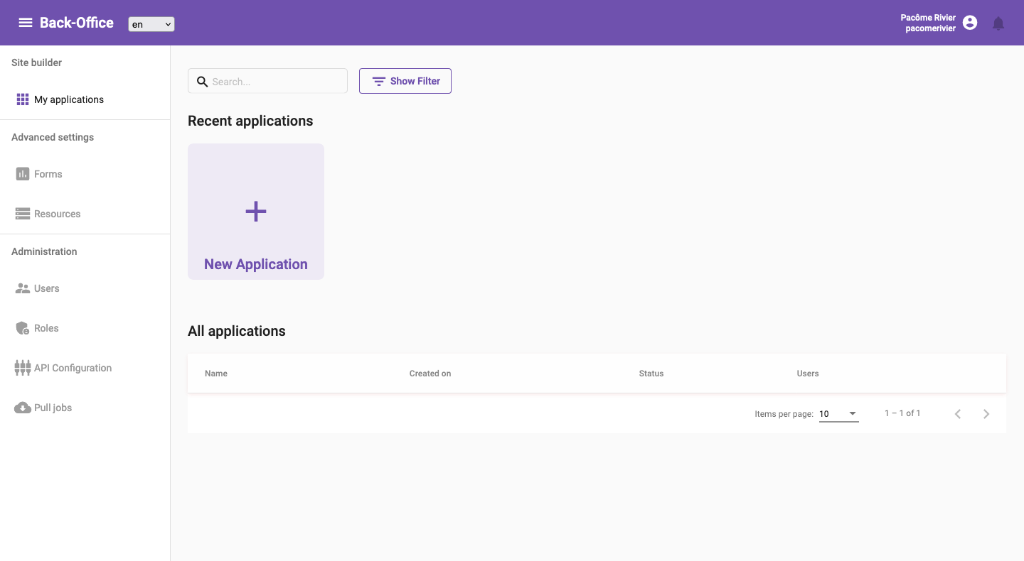
A grid is a type of Widget, so you must first have an Application and a Dashboard page to create a grid widget. You can quickly create an application by going to the Applications page and clicking on the New Application button.
Applications page with New Application button
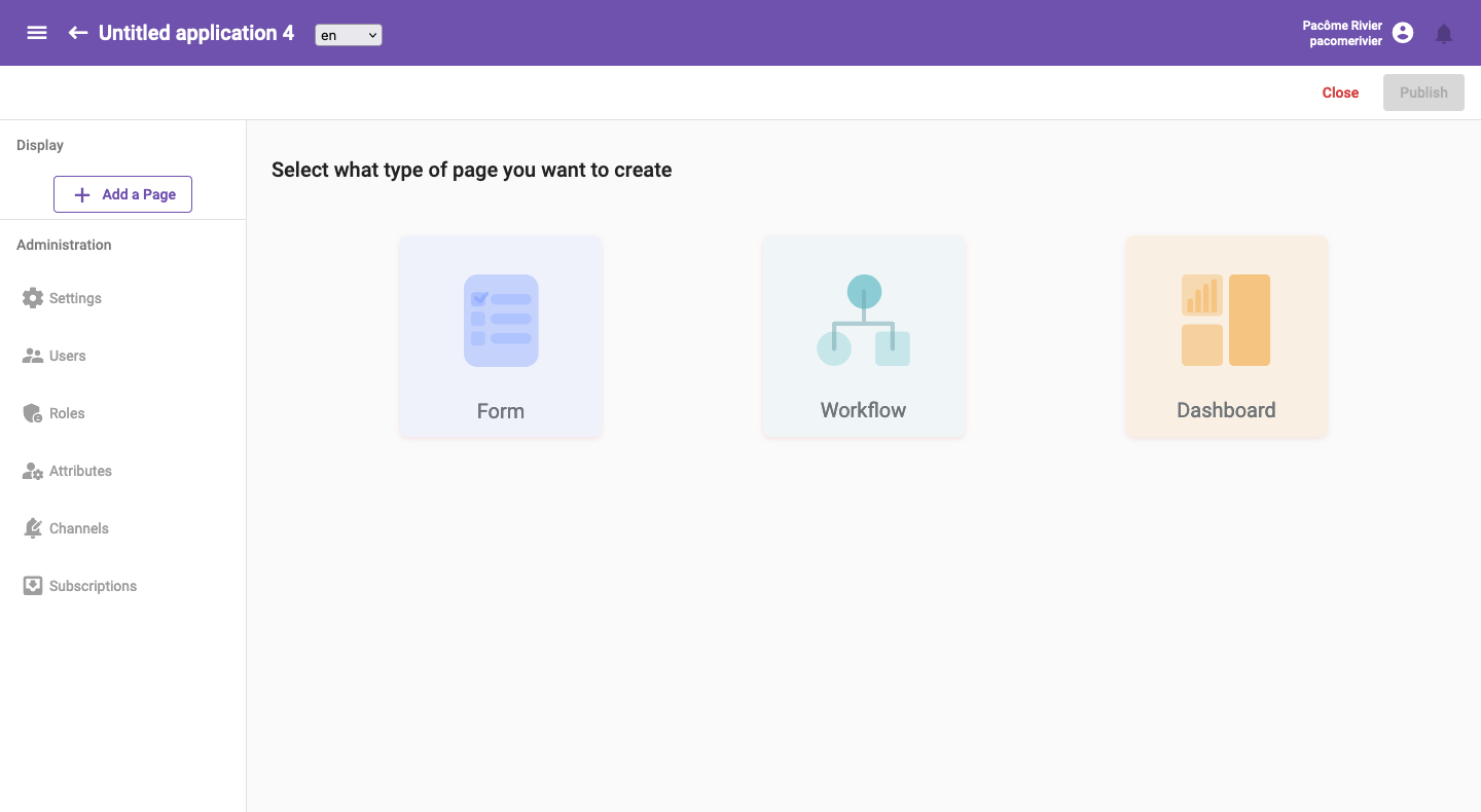
Then you can create a dashboard page by clicking on the Add a Page buttton and selecting the Dashboard type of page.
Add a dashboard page
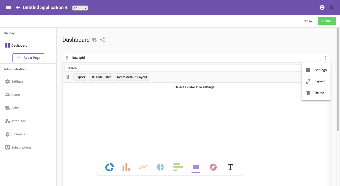
Finally you can create a Grid widget by clicking on the corresponding icon.

Select data source
Once the widget is created, the first thing to do is to select the dataset from which you want to display records. You must open the Settings and select the dataset using the dedicated text input with autocompletion.
Open settings and select dataset
Click on the Settings button.
Select a dataset.
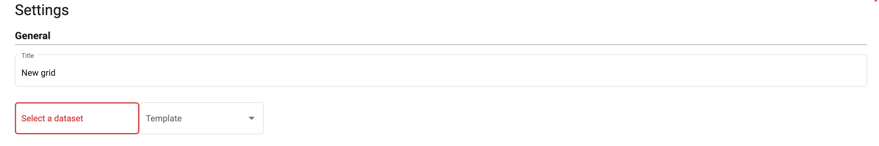
You can select either a Form dataset type or a Resource one. The difference will be that with resources, you will get record from the Core Form and all its children whereas with a simple form, you will only get records from itself.
Configure display
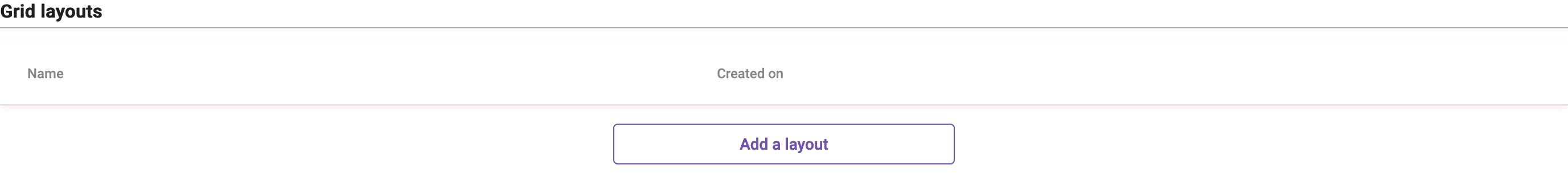
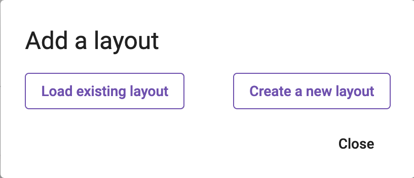
Once your datasource is selected, you can add one or many different Layouts which will be used to configure how the grid is rendered. Those can be shared among grids using the same dataset. In order to add your first layout, you must click on the Add a layout button under Grid layouts settings category and then on Create a new layout.
Create a new layout
Click on the Add a layout button.
Create a new layout.
Once created, you can name your layout so it will be easier for you and other user to know what it is supposed to display. Then there are multiple tabs to configure the data you want to display.
- Fields
- Sort
- Filter
- Style
- Preview
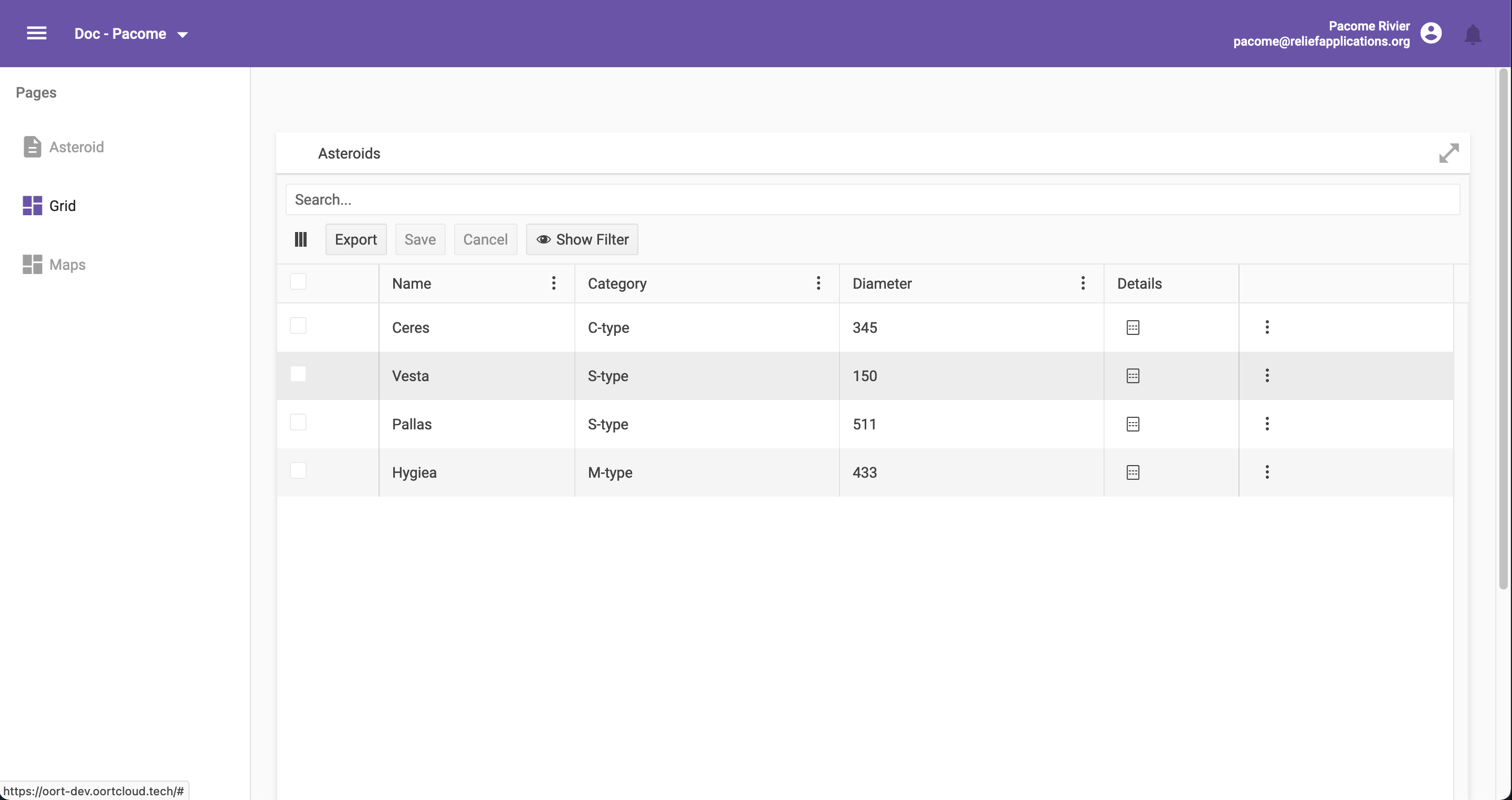
In the Fields tab, you can drag and drop fields you want to display into your grid. You can also give them specific labels by clicking on the ✏️.
Some fields may be OBJECTS or LIST and you must then select subfields you want to have displayed in the grid by clicking on the ✏️.
In the Sort tab, you can select a field to sort on and a sort order which can be ascending or descending. This will be the default sorting of records, users will then be able to change the sorting to their needs.
In the Filter tab, you can build complex filters to be applied on records. You can create multiple filter groups and choose the condition applied between them (AND/OR). For each filter group, you can add as many filter element as you want.
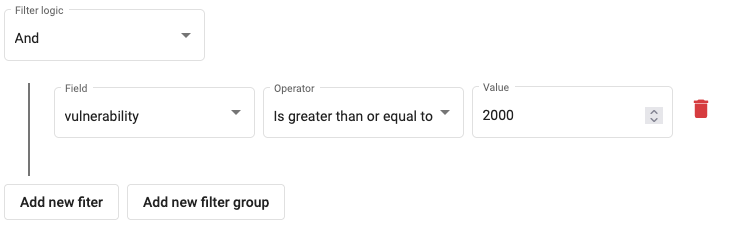
In this easy example, we're filtering records so all of them have a vulnerability field greater than 2000.
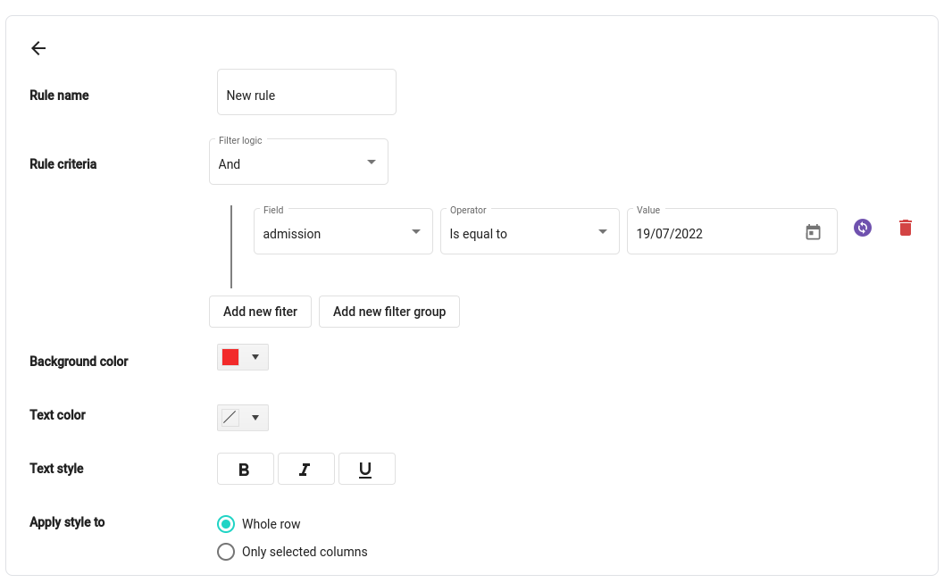
In the Style tab, you can apply custom styles on the rows corresponding to each record by setting up rules. If a record matches the criteria, the styles will be applied for that row.
Style rule
In the Preview tab you can see the current configuration and customize the final display.
You can arrange the column default visibility, the column order and the column width. But also set up some default sort/filter which can be updated then by the end user.
Advanced features
If you want to go further, you can customize which action can be seen by the user in the Enabled actions tab. You can also set up complex action buttons in the Quick action buttons tab.