Grid settings
The grid settings allow you to use and customize your grid. You can enhance it with multiple features.
Location
You can access the grid settings from any grid using the top right menu.
Accessing the grid settings
Quick start / Basic usage
Go to the settings menu and then :
- Select a data set
- Select the fields you want to display
- Customize your grid with the different options
Feature description
General tab
| General | Here, you can set up the name of your grid and select a dataset, which is what data you are going to display inside your grid.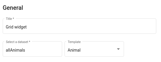 caution A grid won’t work unless you select a data set and choose what field to display. |
| Grid layouts | Here you can create or select an existing layout for the grid widget. A layout especifies the fields from the selected dataset that should be displayed. It also allows filtering, sorting, and adding styling based on the each record's data.Layouts modal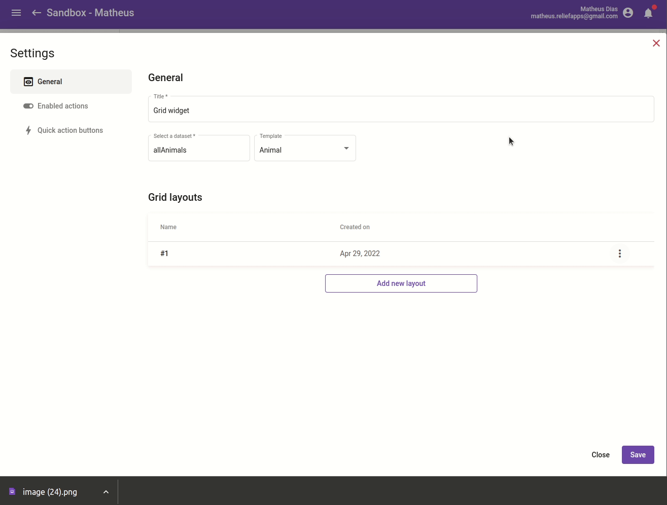 |
Layout selection
| Fields | This tab shows you the list of all available fields from the selected data set. You can then choose which ones you want to display on your grid and their order. caution A field stated as an object must have a selected field itself. 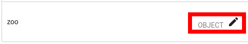 By default, every field has a changed label that delete all “_” and add an upper case to its first letter. You can still use the pen symbol to change the field’s label. 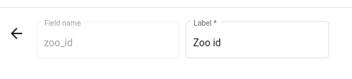 |
| Sort | You can choose by which field you want your record to be sorted by. Depending on the field’s type, multiple kind of filter are available. On a simple text question: 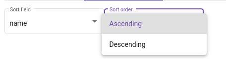 |
| Filter | In the filter tab, you can filter your record by writing or selecting a value, depending on the field’s type. Another option is available for the date type, allowing you to always update the filter’s date by today’s date.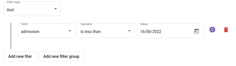 |
| Style | In the style tab, you can apply custom styles on the rows corresponding to each record by setting up rules. If a record matches the criteria, the styles will be applied for that row.Style tab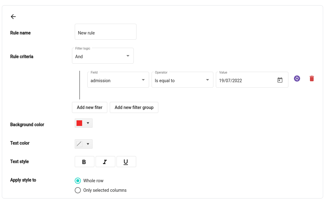 |
| Preview | This tab previews the grid with the current configuration of the layout |
Enabled actions tab
The enabled actions tab has many different options that allows you to specify how the end user can interact with the grid.
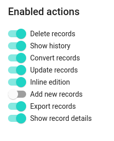
| Delete records | Allows end users to delete records directly from the grid |
| Show history | When checked, the version history of a record will be available in the row options menu |
| Convert records | Allows the end user to convert records |
| Update records | Allows the end user to update records |
| Inline records | Allows the end user to update records directly in the grid, by clicking on a row |
| Add new records | Allows the end user to add new records to the selected dataset directly from the grid |
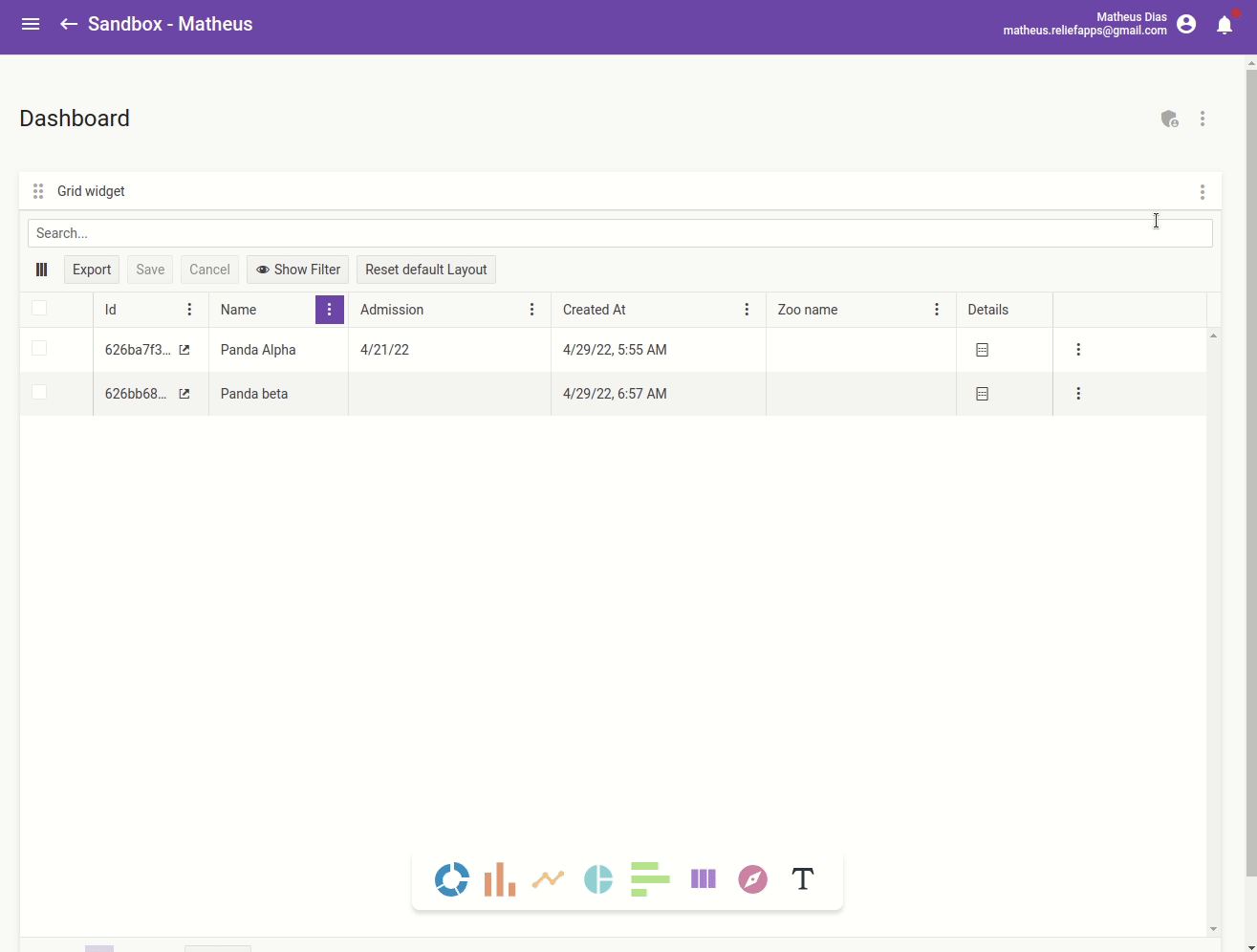
| Export records | When checked, a button will appear on the grid that allow the end user to export the selected records in .XLSX formatExport button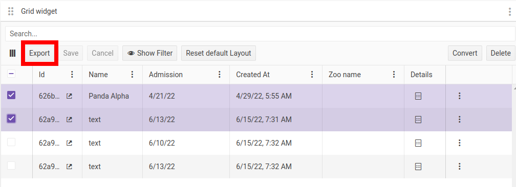 |
| Show record details | When checked, the last column of the grid will be have a button that when clicked displays all the information for a record, regardless of the current layout of the gridDetails column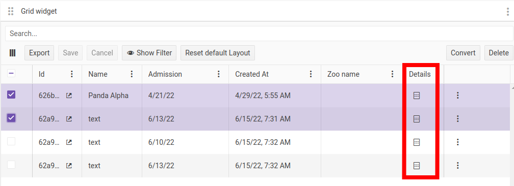 |
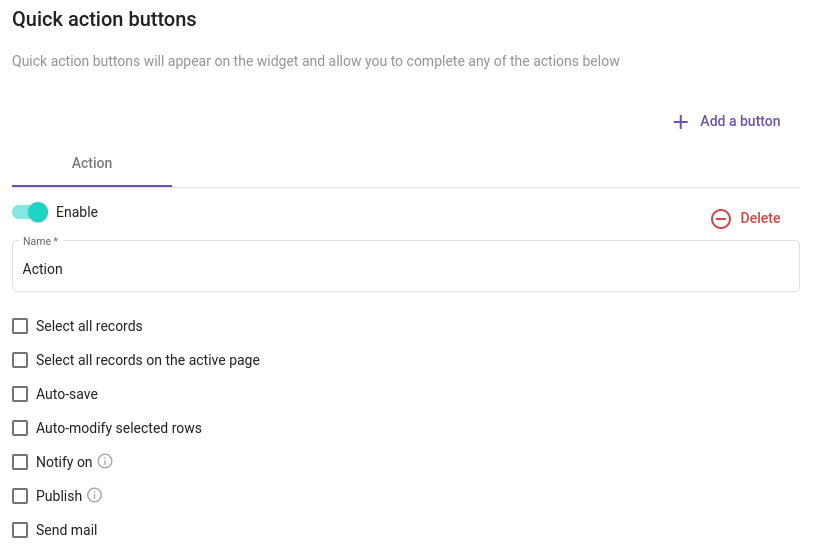
Quick action buttons tab
In this tab, you can add how many action buttons you need. Its goal is to make workflows and dashboards smoother so the user can focus on its work and the data is processed automatically as it would have expected.
Quick actions tab