Grid
Grid is one of the widgets available in a dashboard page / step. Using it, you will be able to display a list of records from a data source, configuring the fields to show and the actions users can execute.
Data displayed by the grid will depend on the logged users permissions, considering their roles and attributes in the application.
Location
Back Office: When editing an application, you will have the possibility to create new pages and workflow steps for this application. The dashboard is one of the content types that can be selected for pages and steps.
Once a dashboard is created, you will have the possibility to add grid widgets to the dashboard.
Add a new grid widget
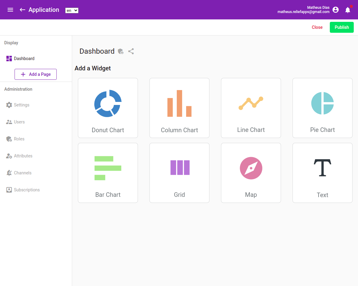
Once a grid widget is created, as an app builder, you will have the possibility to set the data displayed by this grid, and to select the available actions offered to the end users.
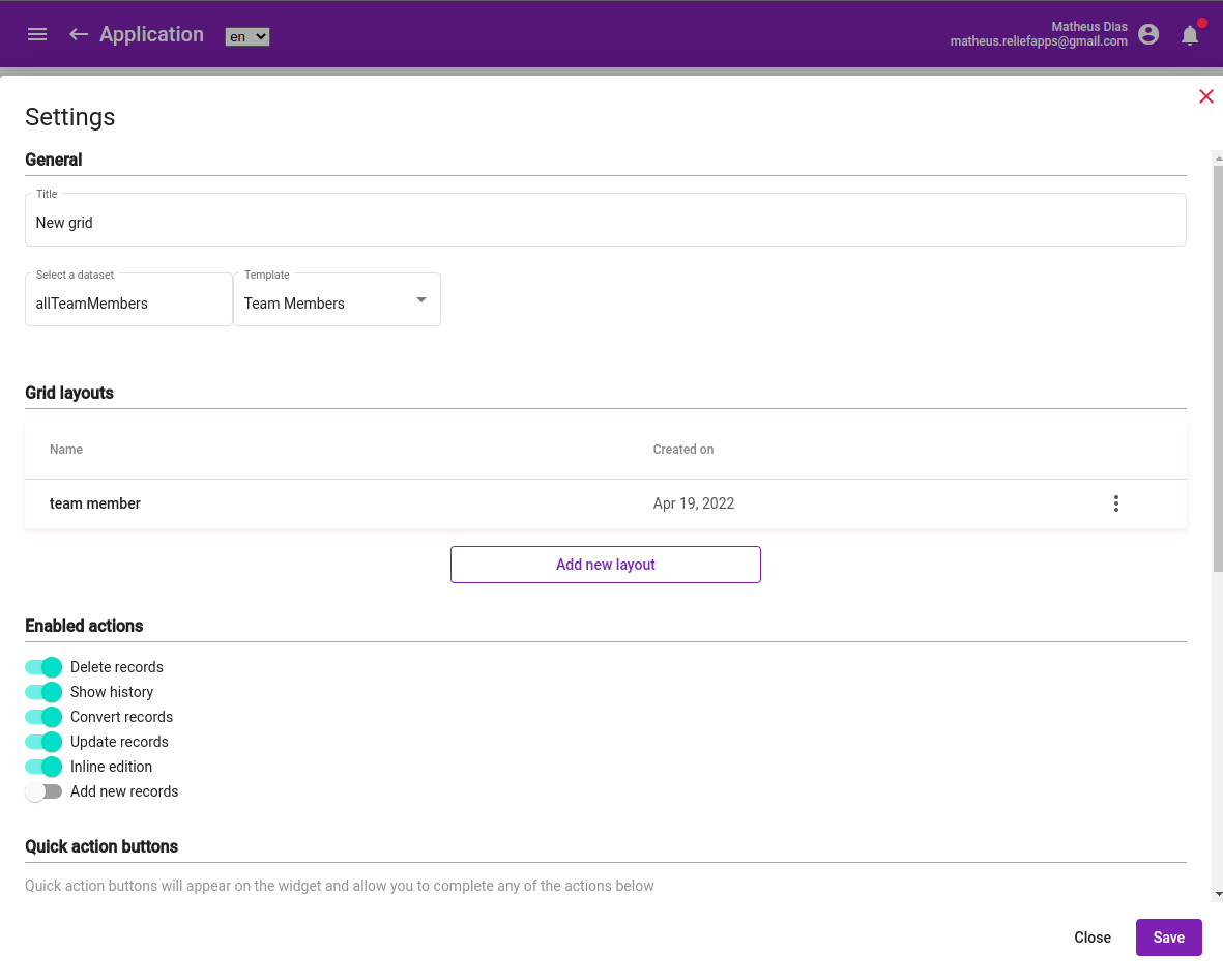
Click on three dots menu, then Settings
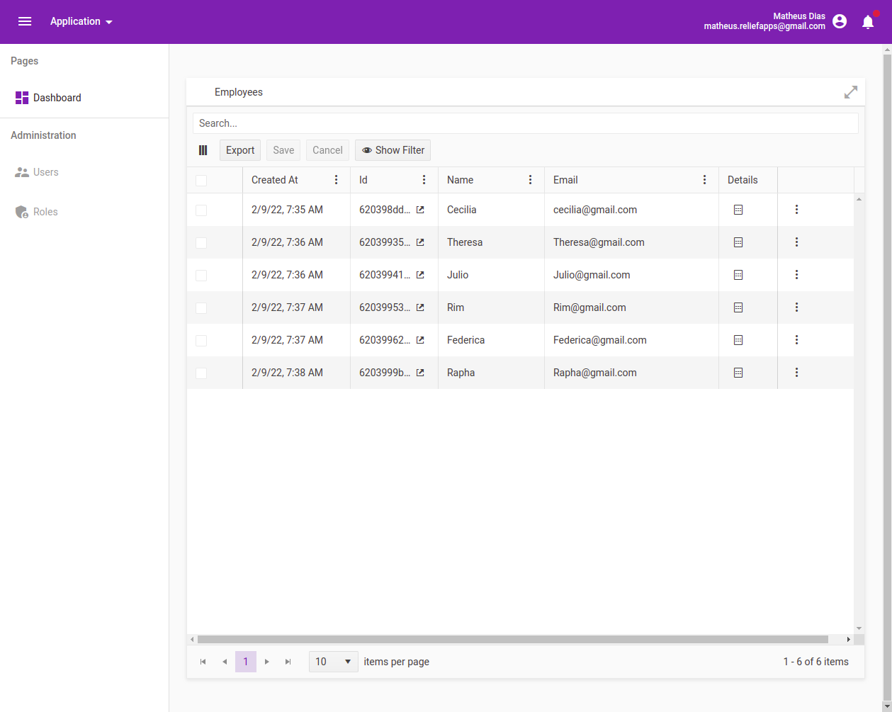
Front Office: Grid widgets created on Dashboard pages / steps can then be shared with the end users that have an access to the application the dashboard is part of.
A grid widget in a Front Office application
Quick start / Basic usage
Once a dashboard is created, you can create a new grid widget as follows:
- Select the GRID option on the toolbar
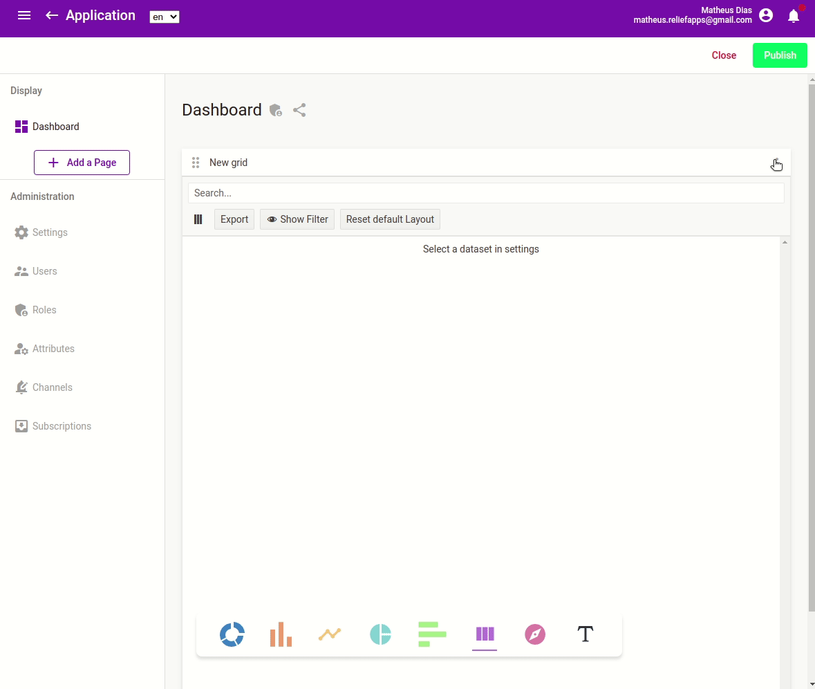
- Click on three dots button of the new widget
- Select the SETTINGS option
- You should then see this page, that will give you the opportunity to configure the grid widget.
Settings of a grid widget
Feature description
Many options are offered by the grid widget. This section details the different option you can configure as an app builder.
| Setting | Description |
|---|---|
| Title | Title of the widget. It will appear at the top of it. |
| Dataset | The resource that will be displayed in the grid. info You can refer to the Query Builder documentation. |
| Grid Layout | The layout details the subset of data that'll be displayed on the grid, it's also where filters can be applied. You can refer to the Query Builder documentation. |
| Enabled actions | Actions permitted to the end users. They will appear when clicking on a record, or selection multiple records. With one record selected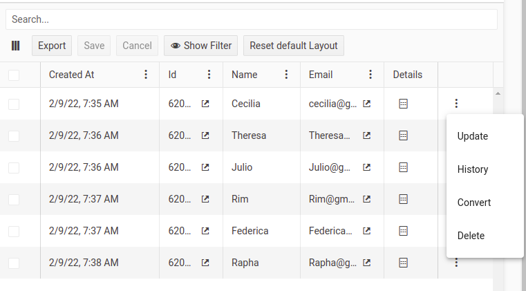 With multiple records selected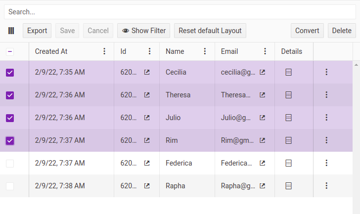 info Available actions also depend on the permissions end users have on the data set. |
| Quick Action button | Configuration of the quick action button. info You can refer to the Quick Action button documentation. |
Enabled Actions
Subsequent actions can be enabled on the grid.
| Action | Description |
|---|---|
| Delete records | End users will be able to delete the records they see. |
| Show history | End users will be able to display the list of the versions of the selected record. Opened history of a record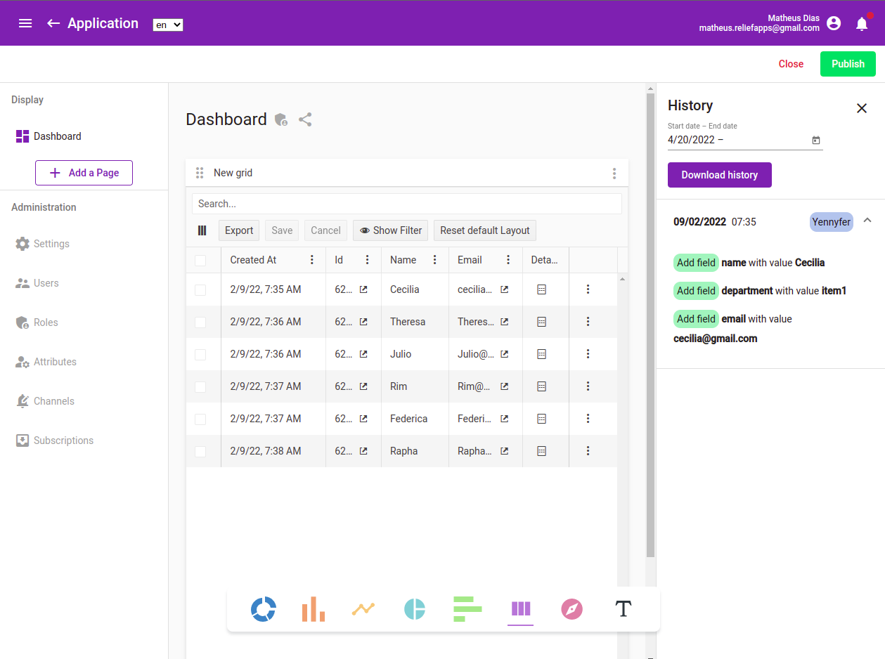 |
| Convert records | End users will be able to convert the records to another type. Initial records can either be duplicated with a new type or deleted. |
| Update records | End users will be able to update the records they see. |
| Inline edition | End users will be able to update the records they see by clicking on them directly in the table. |
| Add new records | End users will be able to add new records directly in the grid view. |
Quick Action button
Please refer to the documentation of the Quick Action button.